Choosing Accurate Colours for Printing
- Jul 26, 2025
- 2 min read
Printers use a combination of four ink colours to create a whole spectrum of different colours. These four colours are Cyan, Magenta, Yellow & Black (Key) or more commonly known as CMYK.

When you want to print a mixed colour, ie., green or purple, two or more of these colours are printed overlapping each other to create a ‘process’ colour.

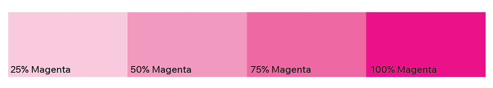
The printer will apply an amount of ink ranging from 0% to 100% of each colour to achieve the desired process colour. The higher the percentage, the more ink is laid down and the more ‘saturated’ the colour is.
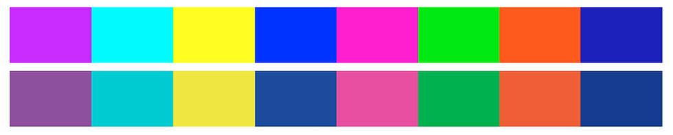
Whilst some bright, vibrant and fluro colours may look great on your screen, printers simply cannot achieve them by mixing a combination of CMYK inks. If you were to try and print one of the below colours, the printer would mix a colour that is ‘the closest possible match’, which can often lead to undesirable and disappointing, duller, flatter colours.
Once you have reached 100% magenta, your colour is now 'fully saturated' and all you can do from here is add cyan or yellow, which will start to change the 'pink' colour towards a purple or green tone, not make the pink brighter.
Any colour that can be created on screen will generate a RGB, Hex and CMYK colour value, but unfortunately, it still does not mean that a CMYK printer can actually ‘mix’ that colour. A colour that cannot be mixed by a printer is called ‘out of gamut’, meaning out of range. Once the selected colour is back in range, the warning icon will disappear.

The Solution
Always choose colours that are available in a CMYK colour profile.
By setting your artwork or document to CMYK instead of RGB, your document will only display CMYK colours. Choosing accurate colours is essential for branding and logos and will ensure that all of your colours across your social media, website and marketing, are uniform, and professionally represent your business’s branding. You can create many amazing colours in CMYK, just like the ones below!


